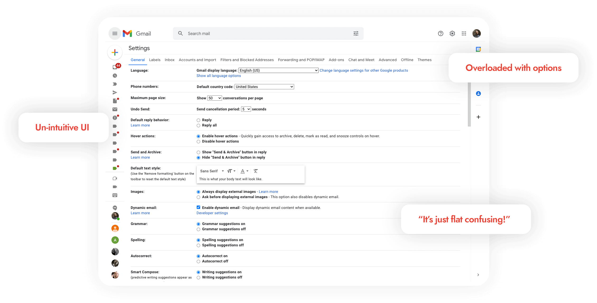
After some recent complaints from some of Google’s largest enterprise G Suite customers about a part of Gmail that has been largely neglected for 15 years, customers are complaining that the Gmail Settings interface is confusing, unintuitive, and overloaded with options.
After a quick 48hrs, we've brainstormed some solid ideation and solutions around creating a more intuitive and welcoming user experience for Gmail Settings.
See below for current issues and our solutions.
Human Experience
Interviews We conducted 4 interviews with Gmail users and asked them the following questions:
Do you have a hard time using Gmail Settings? Why? What would be your main needs when visiting Gmail Settings? What might be your first reason to visit Gmail Settings?
Results Most of the interviewees don’t find themselves in Gmail Settings but one thing was clear, they wanted something easy to use:
“I don’t want to have to scroll through a bunch of stuff to find what I need.” “I need to change my signature soon, is that in settings?” “I would and often do visit Gmail Settings to change my vacation responder.”
Our Approach
We conceptualized a mobile-first user experience, based around our audience feedback, prototyping in low-fidelity wireframes. Our approach was simple; clean up the confusing UI by creating a mobile-first responsive / app like experience where users can find the most requested options, quickly and easily.
The Solution
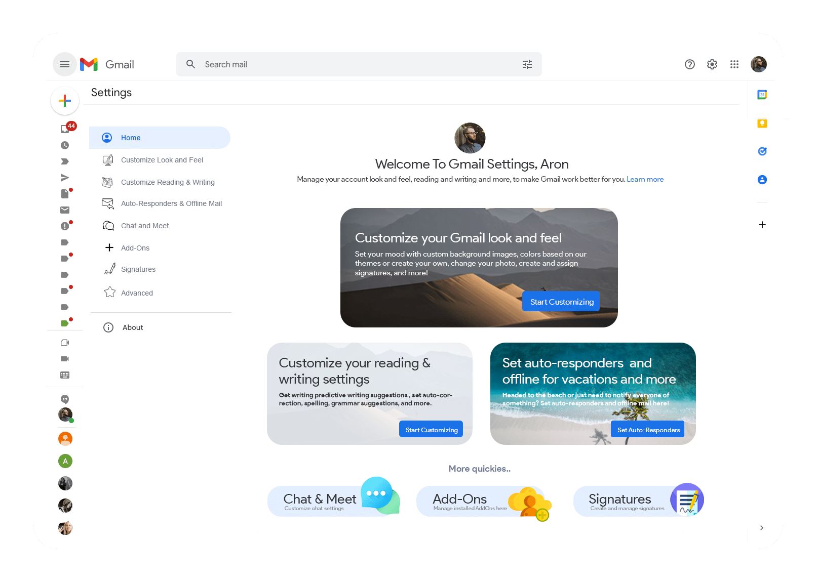
We re-structured the information into an intuitive card layout user experience where the user can find what they need, quickly and easily with beautiful visuals as association to popular topics.
We've also replaced the top, horizontal navigation with a clean vertical nav with iconography, re-enforcing the card UX, while also categorizing additional settings within "Advanced" settings.
Intuitive Card Layout UX
We've listened to what our users were saying. We re-structured the information into an intuitive card layout user experience where the user can find what they need, quickly, vs digging through layers of words.
Settings 2.0
🍪 This website uses cookies to improve your web experience.